- iOS
- App Store
- Checklist
iPhone Duo ships October 23: a checklist to get your iOS app ready
Get your iOS app ready for iPhone Duo: build with Xcode 27.1, adopt the UIScene life cycle, fix vertical bars and the fold, and plan your new screenshots.
AppRanker team14 min read
On this page
Apple's first foldable goes on sale in three weeks. iPhone Duo opens for pre-order on October 16 and reaches customers on October 23, with a 5.4-inch outer display, a 7.6-inch inner display and a starting price of $1,999, according to Apple's announcement. It ships with iOS 27.1, and your app is going to be on it whether you prepare or not.
The question is how it will look when it gets there. An app that nobody has touched since the iOS 26 SDK will run, but on the open phone it sits in the middle of the big screen with black bars on both sides. On the Apple Developer Forums, the threads since Xcode 27.1 beta arrived are full of the same few problems: the simulator that will not show up, toolbars that refuse to move to the side, a portrait lock that stops working, and the question of when an iPhone Duo build can actually be submitted.
This guide covers what Apple has documented, what developers are running into in the beta, and a checklist to work through before launch day.
What your app looks like on iPhone Duo, by SDK
How much of the screen your app gets depends on which SDK you build it with. Apple spells this out in its tech talk Prepare your app for iPhone Duo:
| You build with | Closed (outer display) | Open (inner display) |
|---|---|---|
| iOS 26 SDK or earlier | Uses the space to the left of the status bar and camera | "A familiar size and aspect ratio": a centered iPhone layout with empty space around it |
| iOS 27 SDK (Xcode 27) | Resizes like any iPhone app | Extends to the left of the status bar area, but not edge to edge |
| iOS 27.1 SDK (Xcode 27.1) | Full screen | Edge to edge, with navigation and toolbar buttons laid out vertically under the status bar |
So there is no hard failure for old binaries, but there is an obvious visual gap. AppleInsider's take after the announcement was that developers will have to update apps to look even reasonable on the new phone, and Apple's own launch material names Netflix, Zoom and Slack as apps that already take advantage of the folding design. Your competitors' apps will be shown side by side with yours on the same device.
That table also explains why "just ship it later" carries a cost. Getting to the bottom row takes two separate steps: moving to the iOS 27 SDK, which has its own breaking change, and then rebuilding with 27.1.
Step 1: Move to the iOS 27 SDK and adopt the scene life cycle
Before any foldable work, check that your app launches at all when built with Xcode 27. Apple has been warning about this since iOS 18.4 in TN3187: in the major release after iOS 26, the UIKit scene-based life cycle is "required when building with the latest SDK; otherwise, your app won't launch."
That release is iOS 27. Developers who built an older project with the new SDK hit it immediately, for example in this Expo issue, where the app stops with:
Application failed to launch: UIScene life cycle is required for apps built with this SDK.
See Technote TN3187 for more information on migration.
Your app needs to migrate if the UIApplicationSceneManifest key is missing from its Info.plist (or has no configurations), or if the app delegate does not implement application(_:configurationForConnecting:options:). The simplest fix is a scene manifest plus a scene delegate that owns the window:
<key>UIApplicationSceneManifest</key>
<dict>
    <key>UIApplicationSupportsMultipleScenes</key>
    <false/>
    <key>UISceneConfigurations</key>
    <dict>
        <key>UIWindowSceneSessionRoleApplication</key>
        <array>
            <dict>
                <key>UISceneConfigurationName</key>
                <string>Default Configuration</string>
                <key>UISceneDelegateClassName</key>
                <string>$(PRODUCT_MODULE_NAME).SceneDelegate</string>
            </dict>
        </array>
    </dict>
</dict>
import UIKit

final class SceneDelegate: UIResponder, UIWindowSceneDelegate {
    var window: UIWindow?

    func scene(_ scene: UIScene,
               willConnectTo session: UISceneSession,
               options connectionOptions: UIScene.ConnectionOptions) {
        guard let windowScene = scene as? UIWindowScene else { return }
        let window = UIWindow(windowScene: windowScene)
        window.rootViewController = RootViewController()
        window.makeKeyAndVisible()
        self.window = window
    }
}
Move any UI setup out of application(_:didFinishLaunchingWithOptions:) and into the scene delegate. Work that is app-wide, like analytics or crash reporting setup, can stay in the app delegate. Pure SwiftUI apps using the App protocol already run on scenes.
If you build with a cross-platform framework, the fix usually lives in the framework's template rather than your code. In the Expo case, the maintainers shipped an opt-in scene setting in a later SDK, so check your framework's release notes for Xcode 27 before you hand-edit generated files.

Most of the iPhone Duo work starts with a rebuild: first against the iOS 27 SDK, then against 27.1. Photo: Tirza van Dijk / Unsplash, via Wikimedia Commons, CC0
Step 2: Get the iPhone Duo simulator running
Xcode 27.1 beta, released on September 18, is the first Xcode with the iOS 27.1 SDK and an iPhone Duo device in Device Hub. Buttons at the bottom of the simulator let you open, close, rotate and fold the device.
The most common early question on the forums was "unable to locate the iPhone Duo simulator" after installing the beta. The accepted answer: go to Settings > Components in Xcode 27.1 and press Update next to the iOS 27.1 runtime, even if it already looks installed. You can then add the device from Device Hub with + > iPhone > iPhone Duo. One developer in the same thread reported that the Duo simulator is slow on an M1 Mac, so budget for that on older hardware.
Xcode 27.1 also renames the app modernization skill introduced at WWDC26. It is now called App Resizability, and Apple says it now covers SwiftUI and iPhone Duo as well as UIKit. It is a quick first pass over a large codebase before you start walking through screens by hand.
Step 3: Stop making layout decisions from the device
Apple's guidance in Preparing your app for iPhone Duo is blunt: don't use userInterfaceIdiom or UIInterfaceOrientation for layout decisions. iPhone Duo is still an iPhone idiom, but it moves between very different sizes:
- Outer display: compact width and regular height in portrait, compact in both directions in landscape, like other iPhones.
- Inner display: regular width and regular height, which is room for a sidebar.
Read size classes from the environment or the trait collection, and size views relative to their container or scene, not the screen:
// SwiftUI
@Environment(\.horizontalSizeClass) private var horizontalSizeClass
@Environment(\.verticalSizeClass) private var verticalSizeClass

// UIKit
traitCollection.horizontalSizeClass
traitCollection.verticalSizeClass
Two more habits that break on a phone with two displays:
UIScreen.main. Apple calls it "ambiguous" on a device with two displays and says it will be deprecated in a future release. UsetraitCollection.displayScaleinstead ofUIScreen.main.scale, and if you really need the screen, read it fromwindow?.windowScene?.screen.- Symmetric safe areas. Vertical bars can sit on either side, so code like
view.bounds.width - view.safeAreaInsets.left * 2gives the wrong width. Useview.bounds.inset(by: view.safeAreaInsets).widthand handle each edge separately.
Portrait-only apps
This is where many teams get surprised. On the outer display, your supported orientations behave as on any iPhone. On the inner display, Apple's tech talk says the device "doesn't honor your supported interface orientations": your app is scaled instead, including in Split View. Asked during Apple's iPhone Duo group lab, as recorded in this forum summary, whether there is a sanctioned way to lock the inner display to portrait, Apple's answer was no.
UIRequiresFullScreen is still honored, which keeps your app out of Split View, but the app still resizes as the phone opens and closes. There is no switch that keeps the old fixed iPhone layout forever.
Step 4: Let the system move your bars to the side
The most visible iPhone Duo change is that navigation bars, toolbars and tab bars can lay out vertically along the side of the display. That happens on the outer display when the phone is closed, and for some views on the inner display.
You only get this if you use the bars the containers provide. Apple's documentation is specific:
- In SwiftUI, attach
.toolbarto content inside aNavigationStackorNavigationSplitView. - In UIKit, set toolbar items on a view controller inside a navigation controller, rather than building your own
UIToolbar,UINavigationBarorUITabBar.
Custom chrome stays horizontal and can end up in the wrong place. One developer on the forums found that wrapping a NavigationStack in a Group kept toolbar items out of the vertical bar until the Group was removed. If your bars do not move in the simulator, check your view hierarchy for wrappers like that first.
Then organize the items so they survive the trip:
- Give every item an icon and a title. A vertical bar shows icons only. An item with a title but no icon, or with a custom view, is never placed in the vertical bar.
- Put Back, Close and Done at the top. Use
.topBarPinnedTrailingin SwiftUI orpinnedTrailingGroupin UIKit for a prominent action like Done. - Decide what goes to overflow.
visibilityPriority(_:)in SwiftUI andvisibilityPriorityonUIBarButtonItemset which items the system moves into the overflow menu first.
NavigationStack {
    EditorView()
        .toolbar {
            ToolbarItem(placement: .topBarPinnedTrailing) {
                Button("Done", systemImage: "checkmark") { save() }
            }
            ToolbarItem {
                Button("Share", systemImage: "square.and.arrow.up") { share() }
            }
            .visibilityPriority(.high)
        }
}
Sheets on the outer display get vertical bars by default. If a sheet reads badly that way, toolbarVerticalBehavior(.disabled) in SwiftUI or preferredVerticalBarBehavior in UIKit turns it off for that presentation. For a hero image behind a vertical bar, backgroundExtensionEffect() or UIBackgroundExtensionView extends it underneath.
Step 5: Handle the fold and the inner camera
When the phone is partially folded, the fold runs through the middle of your view. On the inner display, the front camera can cover part of your content whenever it is active. iOS 27.1 calls both of these reserved regions: a division (the fold splitting a view in two) and an occlusion (hardware covering content).
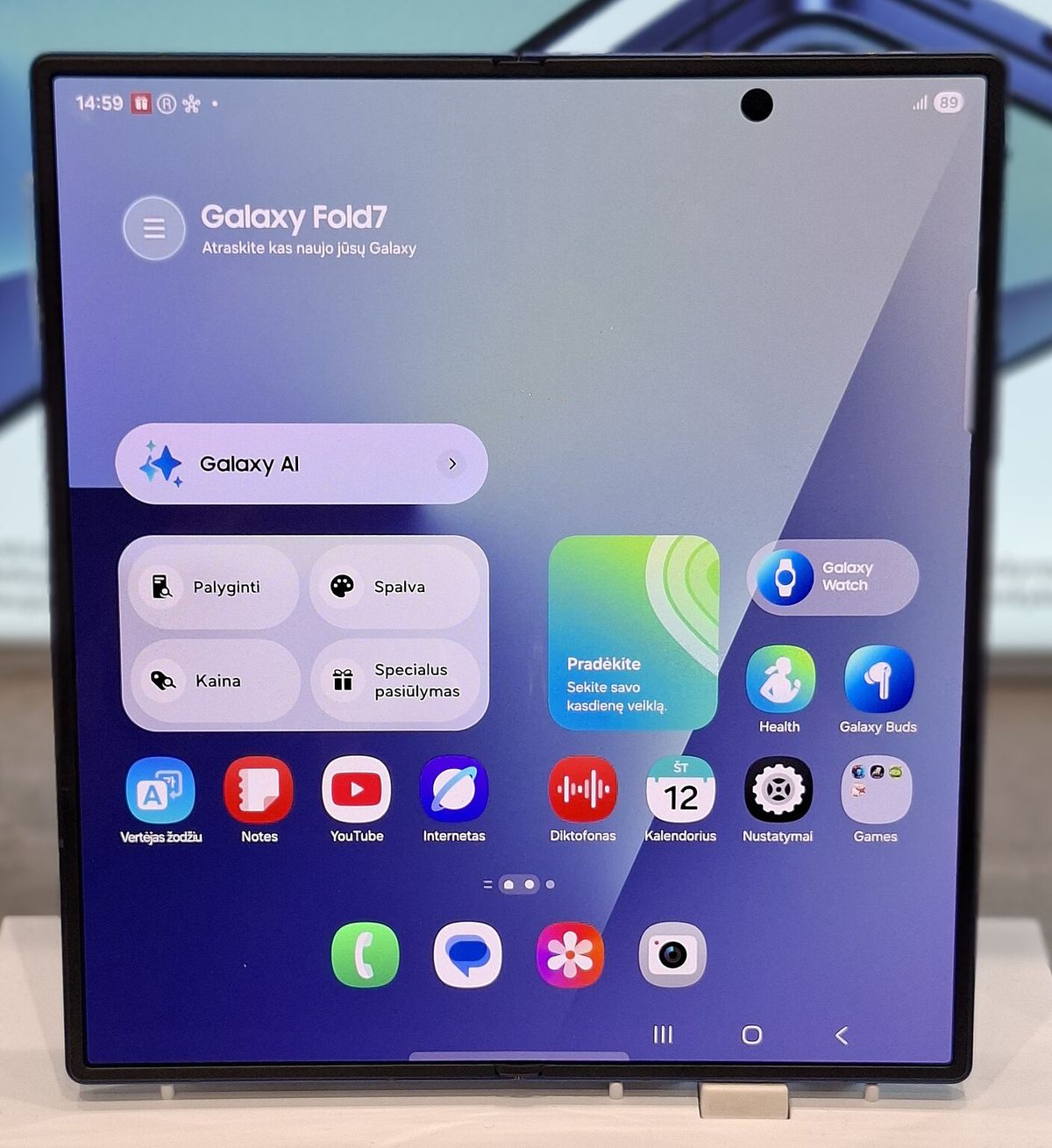
On any book-style foldable, the inner display is nearly square and a front camera sits inside it, so content has to avoid both the camera and the fold. Photo: Matabalt, Wikimedia Commons, CC0
Standard containers already work around both. For your own layouts there are two new tools, both iOS 27.1 and both worth gating behind if #available(iOS 27.1, *) if you support older releases:
- Arrangement views (
ArrangementViewin SwiftUI,UIArrangementViewControllerin UIKit) hold a primary and a secondary view. The split style puts them side by side or stacked and moves them off the fold; the overlay style layers one over the other when flat and separates them around the fold when partially open. Apple's example limits a split to horizontal layouts:
ArrangementView {
    PrimaryView()
} secondary: {
    SecondaryView()
}
.arrangementViewStyle(.split.axes(.horizontal))
- Reserved region queries return the frames to avoid:
reservedRegions(kind:options:layoutDirectionBehavior:)on a SwiftUIGeometryProxy, orreservedRegions(kind:options:)on aUIView. A fold region is active when the phone is partially open and inactive when it is flat.
Apple advises against putting an arrangement view inside a list, scroll view or navigation split view, where part of it could become unreachable.
If you want to react to the hinge itself, onHingeChange in SwiftUI and UIHingeInteraction in UIKit report closed, partially open and fully open, plus a live angle. The group lab answer is to use that for effects and interactions, and to keep layout on the arrangement and reserved region APIs. There is no single "pose" value; infer it from hinge status, orientation and size class together.
Step 6: Test multitasking and state
Two iPad behaviors arrive on iPhone with Duo. In the tech talk on multiple displays and scenes, Apple says all apps participate in multitasking on iPhone Duo, where two apps can sit side by side. And it is the first iPhone that supports multiple instances of your app's UI, but new windows can only be created on the inner display. Handle errors when you request a new scene, or use UIWindowSceneActivationAction, which hides itself when a new window is not available.
To test Split View in Device Hub, open the device, drag your app by the home indicator to one side, then to the other. Vertical bars can appear on either side of your app, so check both.
The good news from the same group lab summary: opening and closing is a size and trait change, not a new scene. Your process stays alive, and the system generally keeps text input and scroll position. If you lose state when folding, look for code that rebuilds view models on size changes, not for a life cycle bug.
Step 7: Plan your submission and your listing
Here is the timing problem developers keep asking about in a forum thread on supported builds. At the time of writing, Xcode 27.1 is still in beta, and builds made with beta Xcode cannot be submitted to the App Store. The community answer in that thread is that layout work using size classes can ship now with Xcode 27, while anything that needs the 27.1 SDK, such as ArrangementView, has to wait for the Xcode 27.1 Release Candidate.
A practical plan:
- Now: ship an Xcode 27 build with the scene life cycle, size-class layouts, fixed safe area math and standard bars. This already moves you to the middle row of the table above.
- When the 27.1 RC lands: rebuild, add the 27.1-only APIs behind availability checks, test every pose in Device Hub, and submit.
- On your product page: App Store Connect already lists screenshot sizes for iPhone Duo: 1398 x 2034 for the outer display and 2007 x 2853 for the inner display (and their landscape versions). Apple notes that uploading them "will be available later this year", so prepare them now and add them when the slot opens.
Screenshots of the open phone are your chance to show the sidebar layout that a letterboxed competitor cannot. Our guide on writing a store listing that converts covers what to put in them, and if you are also preparing the new Creative Assets this fall, our post on App Store search in 2026 covers the rules they have to follow. When the update goes live, consider saying so in the first line of your release notes, where people scanning updates on a new device will see it.
Your iPhone Duo checklist
Build
- App launches when built with Xcode 27 (scene manifest and scene delegate in place).
- Cross-platform framework updated to a release that supports the iOS 27 SDK.
- iPhone Duo simulator installed in Device Hub (Settings > Components > Update if it is missing).
- App Resizability skill run over the project.
Layout
- No layout decisions based on
userInterfaceIdiom, interface orientation orUIScreen.main. - Safe area and margin math handles each edge separately.
- Every screen checked closed, open, rotated and partially folded.
- Portrait-only screens checked on the inner display, where the lock does not apply.
Bars and the fold
- Bars come from
NavigationStack,NavigationSplitViewor navigation controllers, not custom views. - Every toolbar item has an icon and a title; Done is pinned; overflow priorities set.
- Custom views use arrangement views or reserved regions to avoid the fold and the inner camera (iOS 27.1, behind availability checks).
Multitasking and release
- Split View tested on both sides; new-window requests handle failure.
- State survives opening and closing mid-task.
- Xcode 27 build shipped now; 27.1 build ready for the Release Candidate.
- Outer and inner display screenshots prepared for when App Store Connect accepts them.
After launch day
In the first weeks after October 23, people with a new foldable will be finding out which of their apps feel native on the big screen and which do not. If your iPhone Duo update is ready, that is a reason to be talked about, and our launch-week visibility checklist covers lining up the links and announcements around a release like this.
On AppRanker, an iOS app's position is a plain sort on what each listing has paid, and every row links straight to your App Store page. You can paste your App Store link on the home page to see what a place on the board costs today.
FAQ
Will my app work on iPhone Duo if I don't update it?
Yes. Apple says apps run on iPhone Duo even if they were not built with the iOS 27 SDK. Closed, they use the space to the left of the status bar and camera; open, they keep a familiar iPhone size and aspect ratio, which leaves empty space around them on the 7.6-inch display.
Why does my app crash on launch when I build it with Xcode 27?
Most likely because it has not adopted the UIKit scene life cycle. Apps built with the iOS 27 SDK fail with "UIScene life cycle is required for apps built with this SDK" unless they have a scene manifest or implement application(_:configurationForConnecting:options:). Apple's TN3187 walks through the migration.
Can I keep my app portrait-only on iPhone Duo?
On the outer display, yes. On the inner display, Apple says your supported orientations are not honored and the app is scaled instead, and there is no supported way to lock it. UIRequiresFullScreen keeps the app out of Split View, but it still resizes when the phone opens and closes.
When can I submit an app built with the iOS 27.1 SDK?
Not with the current beta: App Store submissions need a release or Release Candidate version of Xcode. You can submit size-class and resizing work built with Xcode 27 today, then submit a 27.1 build with the new iPhone Duo APIs once the Xcode 27.1 Release Candidate is out.
What screenshot sizes does iPhone Duo use on the App Store?
1398 x 2034 pixels for the outer display and 2007 x 2853 pixels for the inner display, plus landscape versions of each. Apple says App Store Connect will accept uploads for the device later this year.
Image credits
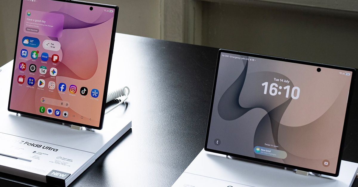
- Cover, two unfolded foldable phones on display stands: photo by ScribblingGeek, via Wikimedia Commons, CC BY-SA 4.0. Cropped to 1200x630.
- Developer at a MacBook: photo by Tirza van Dijk, originally on Unsplash, via Wikimedia Commons, CC0. Resized to 1600px wide.
- Unfolded foldable on a store stand: photo by Matabalt, via Wikimedia Commons, CC0. Cropped and resized.