- Launch
- Marketing
- Checklist
A launch-week visibility checklist for extension and app makers
A launch-week visibility checklist for browser extensions and mobile apps: fix the store page first, then line up links, share cards and placements.
AppRanker team5 min read

On this page
Launch week is the one stretch where a new extension or app has a reason to be talked about. The problem is that most small teams spend it scrambling: the store listing still has placeholder screenshots, the announcement post links to the wrong page, and by the time everything is fixed the attention has moved on.
This checklist is about doing the boring work in the right order, so that every link you share in launch week lands somewhere that is ready for a visitor.
Before launch day: make the store page the destination
Everything you do in launch week points at one place: your store listing on the Chrome Web Store, Microsoft Edge Add-ons, Firefox Browser Add-ons, Google Play or the App Store. That page does the converting. Every other channel only sends people to it.
So finish it first:
- Name. Clear enough that someone skimming a list knows what the product is.
- Icon. Legible at small sizes, because that is how it appears in most lists, including leaderboards.
- Short description. One or two sentences that say what it does and who it is for.
- Screenshots. Real screens of the product doing its main job, in the order a new user would meet them.
- Privacy and permissions. For extensions especially, explain why each permission is needed before a reviewer or a user has to ask.
A second reason to finish the store page early: other sites read it. AppRanker, for example, takes a listing's name, icon, rating and description straight from the store, and builds its share card from the store's own screenshots or banner. Nothing is written by hand on AppRanker's side, so whatever your store page says on launch day is what everyone else shows too.
For a mobile app, a finished page can start collecting users before launch day: Google Play pre-registration and App Store pre-orders notify everyone who signed up the moment you go live.
The week itself: one link, many surfaces
Once the store page is ready, the job is to put its link in as many relevant places as you can, in a way that people actually click. A simple day-by-day plan keeps it manageable.
| When | What to do | Why |
|---|---|---|
| Day before | Final pass on name, icon, description and screenshots | Every other surface copies these |
| Launch day | Publish the listing, then post the announcement | Links should never point at a page that is not live |
| Launch day | Share in the communities you already take part in | People who know you are the likeliest first users |
| Days 2 to 3 | Answer every comment and review | Early replies are visible to everyone who arrives later |
| Days 3 to 5 | Share what you learned, not just the link | A second post needs a reason to exist |
| End of week | Note which channels sent people | That is next launch's plan |
The most common mistake is trying to be everywhere at once and replying to nobody. A handful of well-tended threads usually does more than a dozen abandoned ones.
A plan per day only works if it is small enough to fit on one page. Photo: Estée Janssens / Unsplash
Where a paid leaderboard listing fits
A paid listing is one surface among several, and it is worth being clear about what it does. On AppRanker, a one-time payment puts your app on a public board sorted by what each listing has paid. At the time of writing a new listing starts at $5 and a raise at $1, with no account to create and nobody reviewing the payment. Within seconds of the payment clearing, you have:
- A row on the board that links straight out to your store page.
- A listing page of your own at
/app/<storeId>, showing your rank, your lifetime total, the store description and your screenshots. - A share card built from your store art, so a link to that page previews properly on social sites.
- A spot in the new arrivals on the home page, the short list of the most recent listings to join the board, for as long as yours is among them.
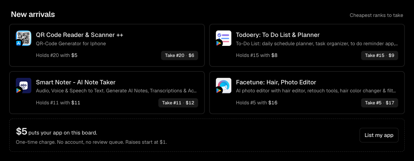
New arrivals on the home page, where the most recent listings sit with their current place and the price of the next one up.
What it does not buy is a guaranteed amount of traffic. Clicks are counted, but never published or promised, and the terms say so explicitly. Treat a listing as a stable, linkable place in front of people who are browsing for new extensions and apps, not as a replacement for the rest of this list.
A position is a place to be seen. The store page is still what turns a visitor into a user.
Use the listing page as a launch link
Because your listing page carries its own share card, it doubles as something to post. The share control on each listing offers X, LinkedIn, Facebook and Reddit, plus copying the link, and every one of them shares the same canonical /app/<storeId> address. That keeps your launch posts pointing at one URL instead of several slightly different ones.
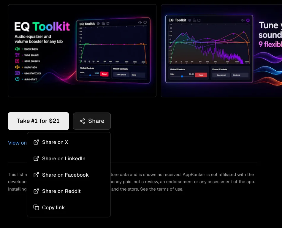
The share control on a listing page. Every option shares the same /app/<storeId> address.
Watch the trending strip, not just the rank
Rank on AppRanker only reflects money. The trending strip on the home page is different: it lists the listings people have clicked most over the last day. If your app shows up there, that is a signal about interest, not spending, and it is worth noting alongside your other launch numbers.

Trending is ordered by the last day's clicks, so a listing at place 20 can sit beside one at place 2.
After launch week
When the week is over, two things are worth doing before the momentum fades.
First, go back to your store page with fresh eyes. The questions people asked in comments and reviews are a direct list of what the description and screenshots failed to explain. Answer them on the page itself.
Second, write down what worked. Which posts sent people? Which communities replied? Did your leaderboard position hold, and did it matter to you? A one-page note now is the difference between the next launch starting from scratch and starting from evidence.
The checklist, in short
- Store page finished before anything is announced.
- One canonical link per surface, pointing at a live page.
- A plan per day, small enough to actually follow.
- Reply to everyone in the first few days.
- Paid placements used for what they are: a visible, linkable position, not a traffic guarantee.
- Notes written at the end of the week.
If you want to see what a place on the board would cost for your app today, paste its store link on the home page. Every position shows its price before you pay.
Image credits
- Cover, half-open laptop: photo by Ales Nesetril on Unsplash, Unsplash License.
- Monthly planner and coffee: photo by Estée Janssens on Unsplash, Unsplash License.