- Store listing
- Launch
- Discovery
Writing a store listing that converts, and travels well beyond the store
How to write the name, icon, description and screenshots of an extension or app store listing so it converts, and looks right everywhere it is shown.
AppRanker team5 min read
On this page
Every promotion effort for an extension or an app ends in the same place: the store listing. Whether a visitor arrives from a launch post, a newsletter or a leaderboard, the store page is where they decide to install or leave. It is also, increasingly, the source other sites copy from when they show your product.
This post covers both jobs: making the listing convert the people who arrive on it, and making it look right when it is shown somewhere else.
Your listing is read in more places than the store
Directories, leaderboards and link previews rarely ask you to write fresh copy. They read what your store page already publishes. AppRanker is a direct example: when an app is listed, its name, icon, rating and description come straight from the store, and they cannot be edited on AppRanker at all. The share card for each listing is built from the store's own screenshots or banner art.
That has a useful consequence. Improving your store listing improves every surface that copies it, at the same time, with no extra work.
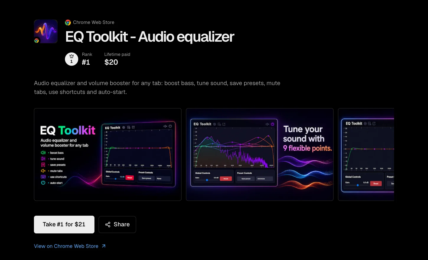
Everything on this listing page except the rank and total, from the icon to the screenshots, is copied from the Chrome Web Store listing.
Name and icon: the first two seconds
In any list, including a leaderboard row, the name and icon are all a reader sees before deciding whether to look closer.
- Say what it is. A name that hints at the job ("tab manager", "habit tracker") does more work in a list than a clever brand word on its own.
- Keep the icon simple. It is shown small in rows and search results. One clear shape on a solid background survives that; fine detail and text do not.
- Test it at small sizes. Look at your icon next to others at the size a list shows it. If it disappears, simplify it.
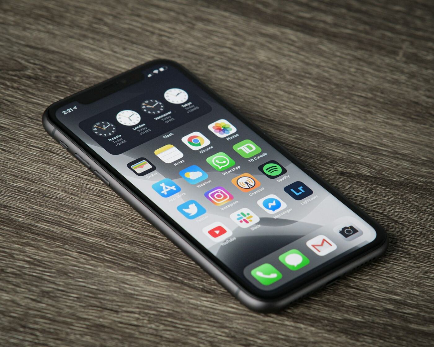
At home-screen size, the icons that read instantly are one bold shape on a flat colour. Photo: Thom Bradley / Unsplash
The description: lead with the outcome
Most readers see only the first line or two of a description before deciding. Put the most important sentence first.
- First sentence: what the product does for the user, in plain words.
- Second sentence: who it is for, or the situation it helps with.
- Then: the main features, as a short list rather than a paragraph.
- Finally: anything that reduces risk, such as what data it does and does not collect.
For browser extensions, the permissions section deserves the same care. A user who sees a broad permission with no explanation will often leave. Saying plainly why each permission is needed is part of the pitch, not a formality.
Write the first sentence of your description as if it were the only one anybody will read. For many visitors, it is.
Screenshots: show the product doing its job
Screenshots carry more weight than any other part of the listing, and they are also the part other sites are most likely to reuse.
What to show
- The main screen of the product, doing the main thing, with realistic content.
- The two or three moments a new user would meet first, in that order.
- Short captions on the image if the store allows it, stating the benefit rather than the feature name.
Landscape, portrait and banners
The shape of your screenshots decides how they can be reused. AppRanker's share cards are a good illustration, because they pick art from your store listing in a fixed order and use the first kind that fits:
| Card | Built from | When it is used |
|---|---|---|
| Banner | Chrome's marquee banner, already a wide 2.5:1 | The listing has a marquee banner |
| Cover | One landscape screenshot, cropped full-bleed | There is a landscape shot, or a portrait listing has only one or two |
| Tiles | Three portrait phone screenshots side by side | A portrait listing has at least three shots |
| Type | Your icon, name and description, with no artwork | The store published nothing usable |
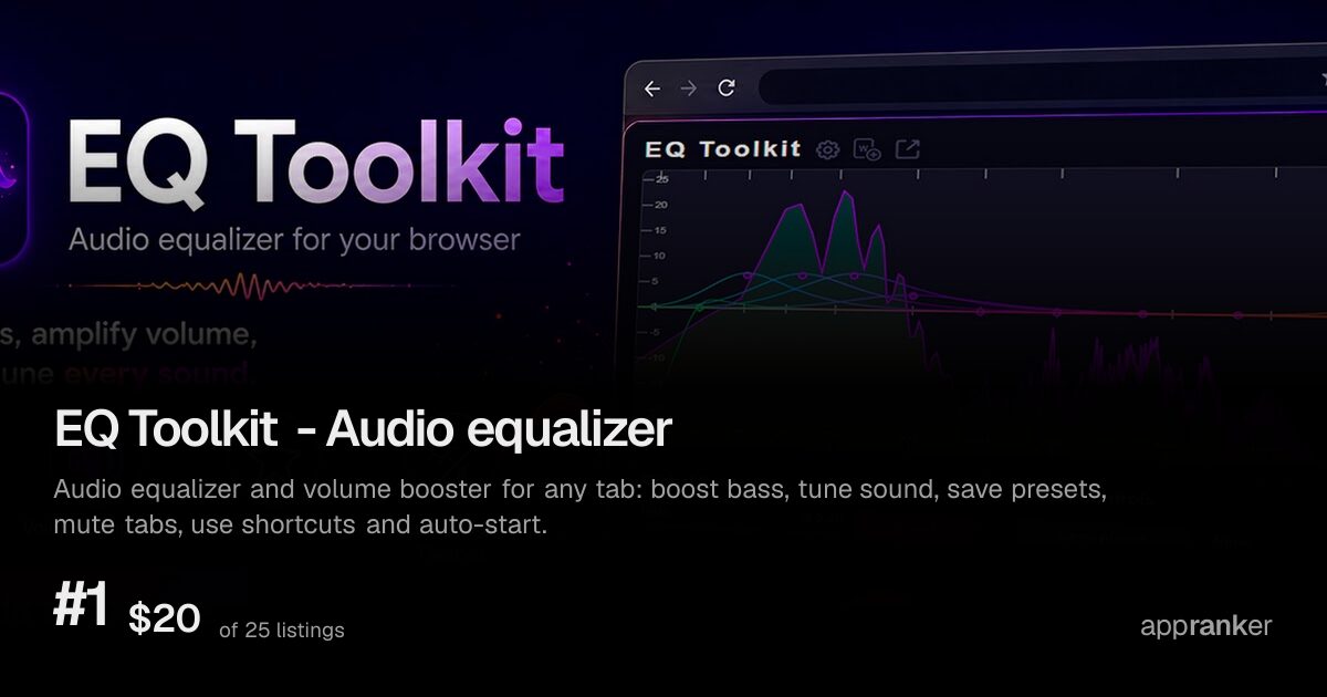
A banner card: a Chrome extension with a marquee promo banner gets it used as it stands.
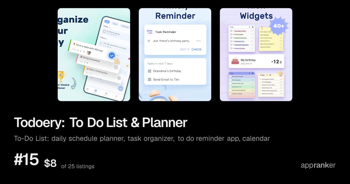
A tiles card: three portrait phone screenshots, the best fit for a mobile listing.
A few practical lessons follow from that:
- Chrome extensions: if you provide the marquee promo banner, it is used as it stands. It is worth designing properly rather than leaving blank.
- Mobile apps: portrait screenshots work best in threes. A single portrait shot cropped into a landscape card keeps very little of the image.
- Edge Add-ons: the store publishes no screenshots through the data AppRanker reads, so Edge listings always get the text-only card. Your name and description do all the work there.
Art is fetched and validated before a card is drawn, so a broken or missing image never ends up on a card; the card simply drops to the next kind in the table. The better your store art, the higher up that list your card lands.
If you are unsure which set of screenshots is stronger, both stores let you measure it with real visitors; our guide to App Store A/B testing shows how.
Ratings and reviews
Ratings are copied from the store too, and a listing with a visible rating reads very differently from one without. You cannot control the score directly, but you can control how you respond:
- Reply to reviews, especially critical ones, with specifics.
- Fix what reviewers report, then say so in the reply.
- Ask for a rating at a moment of success in the product, not on first launch.
A short pre-launch review
Before you point any traffic at your listing, read it once as a stranger would:
- Does the first sentence say what the product does?
- Is the icon recognisable at small sizes?
- Do the screenshots show the product working, in a sensible order?
- For extensions, is every permission explained?
- Does the listing look right when a link to it is previewed?
When those answers are all yes, every channel you use, from launch posts to a place on a leaderboard, sends people somewhere ready to convert them.
If your listing is ready and you want it in front of people browsing for new software, paste its store link on the home page to see what each position on the board costs.
Image credits
- Cover, iPhone home screen: photo by William Hook on Unsplash, Unsplash License.
- iPhone on a wooden table: photo by Thom Bradley on Unsplash, Unsplash License.