- ASO
- App Store
- Google Play
App icon size in 2026: App Store and Google Play specs, Liquid Glass and design rules that help ASO
App icon size for 2026: 1024 x 1024 for the App Store, 512 x 512 for Google Play, Liquid Glass layers, adaptive icons and the upload errors to avoid.
AppRanker team12 min read
On this page
The app icon size you need in 2026 is simpler than the old tables of twenty PNGs suggest: one 1024 x 1024 design for the App Store, and one 512 x 512 PNG for the Google Play store listing, plus an adaptive launcher icon inside your Android app. What has become harder is everything around the pixels. Apple now renders icons as layered Liquid Glass, Android themes icons automatically, and both stores reject icons that carry the wrong kind of text or transparency.
Your icon is also the one asset people see in every search result, top chart and recommendation row, long before they open your page. This guide covers the exact specs, the tools each platform expects, the errors that block uploads, and the design rules that help an icon earn the tap.
Key takeaways
- App Store: design at 1024 x 1024 px. Xcode and the system generate every smaller size. Changing the icon later requires a new app version.
- Google Play store listing: 512 x 512 px, 32-bit PNG, sRGB, up to 1024 KB, full square. Play rounds the corners (30% radius) and adds the shadow.
- Android launcher: an adaptive icon with 108 x 108 dp layers, the logo inside the central 66 x 66 dp, plus a monochrome layer for themed icons.
- No ranking claims, prices, "New" labels or store badges in the icon on either store.
App icon size cheat sheet
| Where | Size | Format and notes | Source |
|---|---|---|---|
| iPhone, iPad, Mac app icon | 1024 x 1024 px | Layered (Icon Composer) or a single image; system masks to a rounded square | Apple HIG |
| Apple Watch | 1088 x 1088 px | Layered; circular mask | Apple HIG |
| Apple Vision Pro | 1024 x 1024 px | Layered 3D; circular mask | Apple HIG |
| Apple TV | 800 x 480 px | 2 to 5 layers for the parallax effect | Apple HIG |
| Google Play store listing | 512 x 512 px | 32-bit PNG with alpha, sRGB, max 1024 KB, full square | Google Play icon specs |
| Android adaptive launcher icon | 108 x 108 dp per layer | Foreground, background and monochrome layers | Android adaptive icons |
| Product page optimization icon test | 1024 x 1024 px | Must already be in the live binary as an alternate icon | App Store Connect Help |
Apple's specification table lists the color spaces it accepts: sRGB, Gray Gamma 2.2 for grayscale, and Display P3 for wide color. Google Play asks for sRGB.
App Store icon size and the Liquid Glass format
Apple's Human Interface Guidelines give a single layout size for iPhone, iPad and Mac: 1024 x 1024 pixels, square. "The system automatically scales your icon to produce smaller variants that appear in certain locations, such as Settings and notifications." Since Xcode 14 you have been able to supply one 1024 image instead of a full set, and with Icon Composer that single design is now a layered file.

Most strong icons start as a dozen rough sketches of one simple idea. Photo: Ivan S / Pexels
Layers, not a flat PNG
Since the 2025 redesign, iOS, iPadOS, macOS and watchOS icons "include a background layer and one or more foreground layers" and "take on Liquid Glass attributes like specular highlights, refraction, and translucency." Apple refined that guidance again on June 8, 2026, according to the page's change log.
The workflow Apple describes:
- Draw each foreground layer in your usual design tool, preferably as SVG or PDF so it stays sharp. Use PNG only for raster art or mesh gradients.
- Import the layers into Icon Composer, which now requires macOS Tahoe 26.4 or later. Set the background there: it supports solid colors and gradients, so you rarely need an image.
- Annotate the Default, Dark and Mono appearances. On iPhone people can choose default, dark, clear or tinted icons, and "the system automatically generates variants you don't provide."
- Add the
.iconfile to your Xcode project, and use Icon Composer's flattened export for your website and press kit.
Three rules from the guidelines prevent most rendering problems:
- Provide square, unmasked layers. Apple warns that pre-masked layers make edges "look jagged" and break the highlight effects.
- Skip your own effects. "There's no need to include specular highlights, drop shadows between layers, beveled edges, blurs, glows, and other effects." The system adds dynamic ones.
- Prefer clear edges. Soft, feathered edges in foreground layers look muddy once the system draws highlights on them.
Not everyone is happy with the result. One developer wrote on Hacker News in June 2026 that after Apple began restyling third-party icons, "People started complaining to us that our app icon looked blurry because of it." The fix is the same advice Apple gives: fewer, bolder shapes, and testing on a device in every appearance.
The upload error that catches Icon Composer users
The most common icon rejection is a transparency error. In an Apple Developer Forums thread, developers quoted it as: "Invalid large app icon. The large app icon in the asset catalog ... can't be transparent or contain an alpha channel." Others saw it as ITMS-90717.
For a classic asset catalog icon, the fix is to flatten the 1024 image onto its background and export it without alpha. You can check a file on a Mac with:
sips -g hasAlpha AppIcon-1024.png
For Icon Composer files, developers in the same thread traced the error to a group with Blur turned on and an SVG near the canvas edge; turning the blur off let them submit. Treat that as a community fix rather than an Apple rule, and validate your archive in Xcode before the upload.
Changing an App Store icon takes a new version
App Store Connect's Add an app icon help is blunt: "If you want to change your app icon after publishing, you must create and upload a new version of your app. Then, submit it for review." The icon lives in the binary, not in your metadata.
That also shapes icon testing. Product page optimization can test up to three treatments, and an icon you want to test "must be part of the app binary for the current App Store version," at 1024 x 1024. Ship the alternate icons one release before the test. If a treatment wins, users who downloaded from it already have that icon on their home screen, so only test icons you would be happy to ship. Our guide to App Store A/B testing walks through both stores' experiment tools.
Google Play icon size and shape
Google Play keeps two icons apart. The store listing icon is uploaded in Play Console under Grow users > Store presence > Main store listing, and Google says it "does not replace your app's launcher icon but should be a higher-fidelity, higher-resolution version" of it. That separation is useful: you can change and test the store icon without shipping a build.
Google's icon design specifications set the rules:
- Size: 512 x 512 px, 32-bit PNG, sRGB, maximum 1024 KB.
- Shape: full square. "Google Play dynamically handles masking. Radius will be equivalent to 30% of icon size." Do not round the corners yourself.
- Shadow: none. "Google Play will dynamically add a drop shadow around the final icon once uploaded." Shadows and lighting inside the artwork are fine.
- Background: pick an opaque color. "Transparent assets will display the background color of Google Play UI," which can make a light icon disappear in light mode.
- Keylines: illustrated art can fill the square; a logo with a distinctive shape belongs on the keyline grid rather than stretched to the edges.
Icons on Play can be tested too. Store listing experiments let you try up to two icon variants against your current one; Google recommends "testing changes to one asset at a time."
Android adaptive icons and themed icons
Inside the app, Android uses an adaptive launcher icon that each device maker masks into its own shape. The adaptive icon guide says to "size all layers to 108x108 dp", keep the logo between 48 x 48 dp and 66 x 66 dp, and leave the outer 18 dp on each side for masking and motion effects.
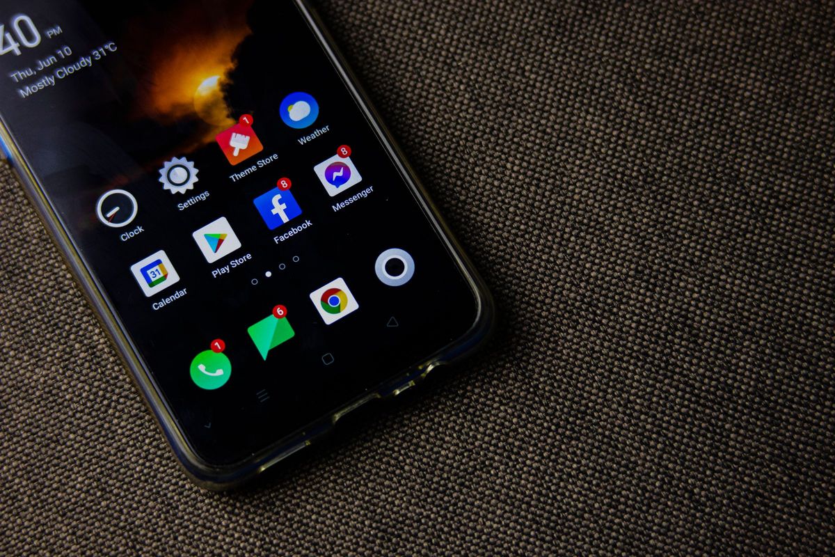
Each Android launcher applies its own mask, so keep the logo inside the safe zone. Photo: Nothing Ahead / Pexels
Add a monochrome layer so your icon can follow the user's theme. Themed icons arrived in Android 13, and Google adds: "Starting with Android 16 QPR 2, Android automatically themes app icons for apps that don't provide their own." If you skip the monochrome layer, the system will invent one for you on newer devices, and it may not look like your brand. The minimal resource, saved as res/mipmap-anydpi-v26/ic_launcher.xml:
<?xml version="1.0" encoding="utf-8"?>
<adaptive-icon xmlns:android="http://schemas.android.com/apk/res/android">
    <background android:drawable="@drawable/ic_launcher_background" />
    <foreground android:drawable="@drawable/ic_launcher_foreground" />
    <monochrome android:drawable="@drawable/ic_launcher_foreground" />
</adaptive-icon>
Android Studio's Image Asset tool generates these layers plus legacy PNGs for older launchers, so you rarely draw them by hand.
What you cannot put in an app icon
Both stores police icon content, and the rules are similar:
- No ranking or award claims. Google's spec page lists as don'ts using text or graphics "to indicate ranking", "to promote deals or incentivize installs" or "to indicate participation in a Play program." Its preview assets help adds: "Do not include badges or text that suggest ranking, price, Google Play categories, or otherwise mislead users."
- 4+ content only. Apple's App Review Guideline 2.3.8 requires icons, screenshots and previews to "adhere to a 4+ age rating even if your app is rated higher."
- Consistency. The same guideline asks that app name and icons, including alternate icons, "are similar to avoid creating confusion."
- No other platforms. Guideline 2.3.10 bans "names, icons, or imagery of other mobile platforms" in your metadata.
- Text only when essential. Apple's guidelines advise against words like "Watch" or "Play" or "New" in the icon; your app name already sits right under it.
Icon design rules that help ASO
The stores do not rank you on your icon's looks, but the icon drives the share of people who tap your result, and installs feed rankings. A few habits pay off:
- Design for 40 pixels, not 1024. Search results and charts show the icon small. Zoom out until it is thumbnail size and check that the main shape is still clear. Apple: "Simple icons tend to be easiest for people to understand and recognize."
- Stand out in your category's search results. Search your top keywords in both stores and screenshot the first rows. If every competitor is blue, a blue icon disappears.
- One idea, no photos, no screenshots. Apple advises against photos and against replicating UI, and both render poorly once masked or tinted.
- Check every appearance. Preview dark, clear and tinted on iOS and themed icons on Android before release.
- Keep it recognizable across platforms. The same core shape on iOS, Android and your website helps people who heard about your app find the right listing.
- Test, then commit. On Play, run a store listing experiment. On iOS, ship alternate icons first, then run a product page optimization test.
The icon is one part of the listing. Our guides to App Store screenshot sizes and writing a store listing that converts cover the rest of the page, and the new app preview video guide covers the video that plays before your screenshots.
A quick script to check your icon files
Before each release, check the two files the stores are strict about. This Python script (it needs Pillow) flags the wrong size, a 1024 App Store icon with an alpha channel, and a Play icon with transparent pixels or an oversized file:
# check_icons.py: python3 check_icons.py appstore-1024.png play-512.png
import os, sys
from PIL import Image

def check(path, size, allow_alpha, max_kb=None):
    im = Image.open(path)
    problems = []
    if im.format != "PNG":
        problems.append(f"format is {im.format}, expected PNG")
    if im.size != (size, size):
        problems.append(f"size is {im.size[0]}x{im.size[1]}, expected {size}x{size}")
    has_alpha = im.mode in ("RGBA", "LA") or "transparency" in im.info
    if has_alpha and not allow_alpha:
        problems.append("has an alpha channel; flatten it onto a solid background")
    if has_alpha and allow_alpha and im.getchannel("A").getextrema()[0] < 255:
        problems.append("has transparent pixels; Play shows its own background through them")
    kb = os.path.getsize(path) / 1024
    if max_kb and kb > max_kb:
        problems.append(f"file is {kb:.0f} KB, limit is {max_kb} KB")
    print(path, "OK" if not problems else "; ".join(problems))

check(sys.argv[1], 1024, allow_alpha=False)
check(sys.argv[2], 512, allow_alpha=True, max_kb=1024)
Make the icon work beyond the stores
A good icon travels: it appears on your website, in press coverage, in launch directories and on leaderboards. AppRanker, for example, shows each listing's icon and name on a public app leaderboard ranked by what each listing has paid, with every row linking to the App Store or Google Play page. If you want your new icon in front of people the day you ship it, paste your App Store or Google Play link on the AppRanker home page to see what each position costs at the time of writing, and read our launch-week visibility checklist for the other places worth listing.
App icon checklist
- App Store icon designed at 1024 x 1024 px, square, unmasked.
- Icon Composer file with Default, Dark and Mono annotations, tested on a device.
- 1024 marketing icon has no alpha channel; archive validated in Xcode.
- Google Play store icon at 512 x 512 px, 32-bit PNG, sRGB, under 1024 KB, opaque, square corners, no shadow.
- Android adaptive icon with foreground, background and monochrome layers; logo inside 66 x 66 dp.
- No ranking claims, prices, "New", awards or store badges in any icon.
- Icon readable at thumbnail size and distinct from competitors in search results.
- Alternate icons shipped in the binary before any App Store icon test.
FAQ
What size should an app icon be for the App Store?
1024 x 1024 pixels. Apple's guidelines list that single layout size for iPhone, iPad and Mac, and the system scales it down for Settings, notifications and other places. Apple Watch uses 1088 x 1088 and Apple TV uses 800 x 480.
Do I still need to export every iOS icon size?
No. A single 1024 x 1024 icon is enough, and with Icon Composer you add one layered .icon file to Xcode. The system generates the smaller variants and any appearance variants you do not supply.
What is the Google Play app icon size?
512 x 512 pixels, as a 32-bit PNG in sRGB, no larger than 1024 KB. Upload it as a full square: Google Play applies a corner radius of 30% of the icon size and adds the drop shadow itself.
Why does App Store Connect reject my app icon for an alpha channel?
The large App Store icon cannot be transparent or contain an alpha channel. Flatten the 1024 image onto a solid background and export it without alpha. If the icon comes from Icon Composer, developers have fixed the error by turning off Blur on groups with SVGs near the edge.
Can I change my app icon without releasing an update?
On the App Store, no: Apple requires a new app version for a new icon. On Google Play, yes for the store listing icon, which you upload in Play Console, but the launcher icon on users' devices only changes with a new build.
Does the app icon affect App Store ranking?
Not directly. The icon affects how many people tap your app in search results and charts, and that conversion, along with installs and ratings, is what moves rankings. That is why icon tests in product page optimization and store listing experiments are worth running.
Image credits
- Cover, Shortcuts app icon on a red iPhone home screen: photo by Brett Jordan on Pexels, Pexels License. Cropped to 1200x630.
- Sketching icon ideas in a notebook: photo by Ivan S on Pexels, Pexels License. Resized.
- Android home screen with app icons: photo by Nothing Ahead on Pexels, Pexels License. Resized.